Welcome to the Brand Page of Personality-Test.net. Our visual identity is crafted to reflect our commitment to self-discovery, personal growth, and authenticity.
Our Brand Identity
The colors of Personality-Test.net are more than just aesthetic choices; they are an integral part of our identity, representing our values and the journey we offer to our users. Our visual language is designed to guide, inspire, and support everyone on their path to self-discovery and personal growth.
Through thoughtful application of our brand palette, we aim to create an environment that is welcoming, inspiring, and reflective of the transformative journey of understanding oneself. Our brand colors are used consistently across all mediums to ensure that our community feels a sense of belonging and trust, no matter where they encounter our brand.
Color Palette
Our color palette, designed with precision and purpose, embodies the spirit of exploration and the transformative journey of understanding oneself. Here, we present our brand colors and their significance, serving as the foundation of our visual identity.
Primary Palette
Our primary palette is a range of deep blues, symbolizing depth, wisdom, and trust. These colors are used prominently across our platform to inspire confidence and reflect our authoritative knowledge in the field of personality assessment.
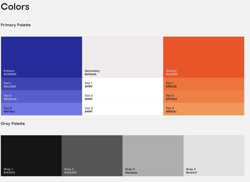
- Primary (#2328a0): A deep, vivid blue that stands for reliability and strength. It’s the cornerstone of our identity, representing the depth of the self-discovery journey.
- Tint 1 (#3c41b9): A slightly lighter shade of our primary color, symbolizing clarity and understanding.
- Tint 2 (#565bd3): An even lighter tint, representing insight and intuition.
- Tint 3 (#6f74ec): The lightest tint, evoking feelings of serenity and harmony, embodying the peace that comes with self-awareness.
Secondary Palette
Our secondary palette consists of soft, neutral tones, providing balance and flexibility within our visual communications.
- Secondary (#efebeb): A light, warm gray that offers contrast and complements our primary palette, representing the foundation and background of our journey.
- Tints (White #ffffff): Pure white is used for clarity, simplicity, and space, creating a breathable, open feel in our designs.
Tertiary Palette
The tertiary palette introduces a vibrant orange, adding a touch of energy, creativity, and enthusiasm to our brand.
- Tertiary (#fa4600): A bold, dynamic orange that stands for creativity and the passion for exploration.
- Tint 1 (#ff6c26): A lighter shade, symbolizing warmth and friendliness.
- Tint 2 (#ff7933): An even lighter tint, representing adaptability and flexibility.
- Tint 3 (#ff924c): The lightest tint, evoking enthusiasm and the excitement of discovery.
Gray Palette
Our gray palette provides a spectrum of neutrals for typography, backgrounds, and supporting elements, embodying professionalism and balance.
- Gray 1 (#151515): A deep, almost black shade for strong typography and grounding elements.
- Gray 2 (#555555): A medium gray for primary text, offering excellent readability.
- Gray 3 (#aeaeae): A light gray for secondary text and subtle details.
- Gray 4 (#e1e1e1): The lightest gray, used for backgrounds and to create separation in design elements.
Logo Usage
- Variations: Our logo comes in several variations to accommodate different backgrounds and contexts. Guidelines include minimum size, spacing, and acceptable backgrounds.
- Incorrect Usage: Do not alter the logo’s colors, proportions, or add any effects that could diminish its visibility or integrity.
Typography
- Primary Fonts: Detailed usage of our primary fonts, including typefaces for headings, body text, and accent text.
- Hierarchy: Clear guidelines on font sizes, weights, and line spacing for creating a visual hierarchy in texts.
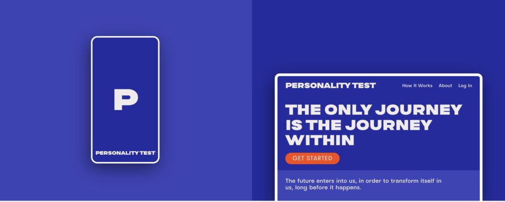
Imagery and Photography
- Style and Tone: Our imagery conveys growth, authenticity, and self-discovery with a focus on natural lighting, diverse individuals, and settings that inspire introspection.
- Usage: Images should complement the content, enhance the message, and maintain the brand’s visual coherence.


Graphic Elements
- Icons and Patterns: Use of brand-specific icons and patterns, including application instructions for digital and print materials.
- Other Elements: Guidelines on the use of borders, shadows, and other decorative elements to ensure they enhance, rather than distract from, the content.
Tone of Voice
- Brand Personality: Our communication is insightful, supportive, and empowering, reflecting our commitment to personal growth.
- Writing Style: We prefer clear, concise language that’s accessible to a wide audience, avoiding jargon and overly technical terms.
Brand Applications
- Templates: Ready-to-use templates for business cards, presentations, and promotional materials, ensuring consistency in all brand communications.

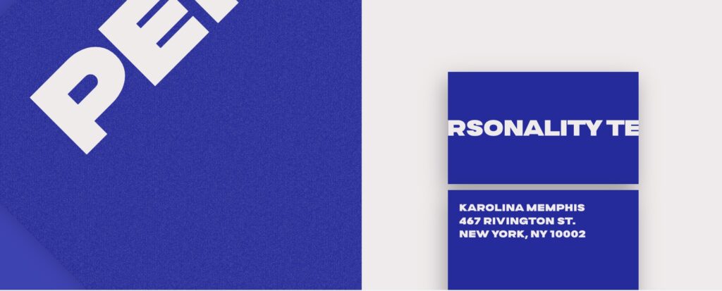
- Examples: Showcasing examples of the brand applied in various contexts, such as website design, social media, and print materials.
Social Media Guidelines
- Profile Aesthetics: Specifications for profile pictures, headers, and post layouts that align with our brand identity.
- Content Creation: Content should be engaging, informative, and reflective of our mission to foster self-discovery and personal growth.
Legal and Copyright Information
- Usage Rights: Guidelines on the appropriate use of brand assets, including copyright and trademark information, to protect our intellectual property.
Contact Information
- Brand Guardianship: Contact details for our brand team, available for queries or clarifications regarding our branding guidelines. Email: Brand@personality-test.net
Our Commitment
At Personality-Test.net, our branding guidelines are crafted with the intention of creating a cohesive and resonant experience for our audience. By adhering to these guidelines, we ensure that our brand remains a trusted and authoritative voice in the realm of personal development and self-discovery.
These expanded branding guidelines are designed to maintain the integrity and consistency of Personality-Test.net’s identity, ensuring that every interaction with our brand is meaningful and aligned with our core values.